Images
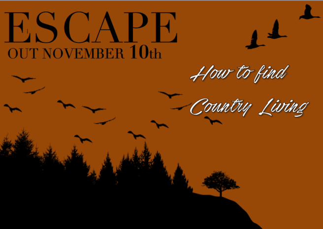
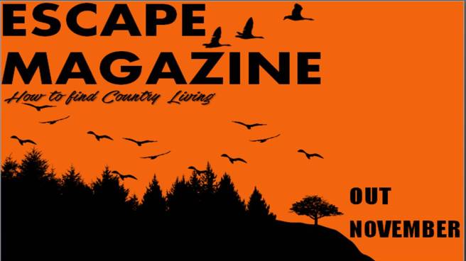
Final Billboard
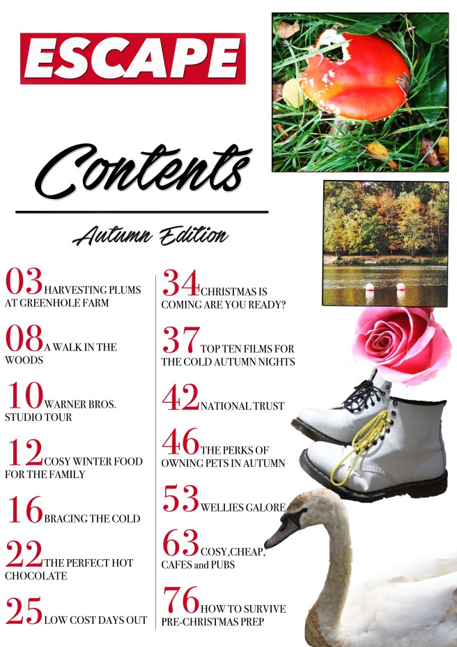
Final Contents Page
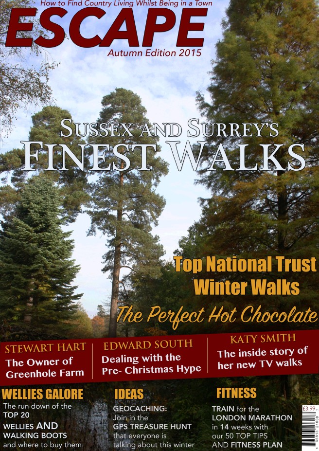
Final Magazine Front Cover

Contents Page- Draft

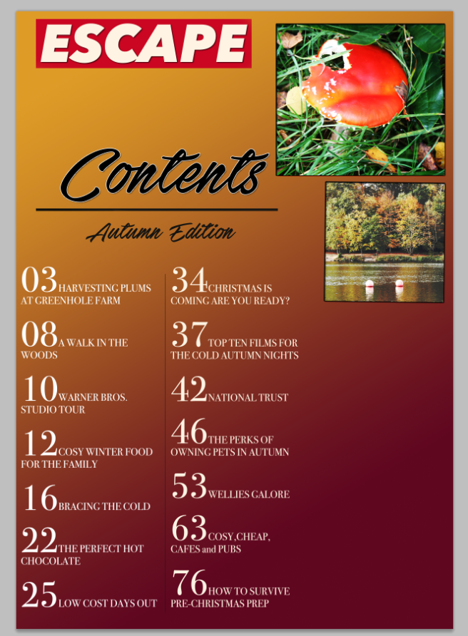
I have created a rough draft of my contents page. Using a gradient background does not work well and looks less professional than a plain background therefore I will be using a plain background.I also think it is too plain on the left hand side therefore I will need to add more images (taken by myself)
Mythical Ideal Consumer- Research/Planning
My mythical ideal consumer is a female aged 30-50. She would be interested in nature and the countryside. She would live in a town or city and would be bored of the activities in her local area. She would want to find new things that she could do over the weekend during her spare time. She would potentially have a family which could also join in with the activities. I will need to use fairly formal language as people of an older age range prefer a formal tone. As well as this i should use a range of high and low frequency lexis so that it fits with my target audience. I should also use a range of female opinions throughout as well as referencing iconic females which are suitable for their age range. As I noticed on the ‘Cornwall today’ magazine from my initial research mood board it was obvious that it was targeted at the same audience as mine, therefore I can use the font inspiration and the front cover as inspiration for my own. My secondary target audience would be men of the same age range as like women of the age they would potentially settled although not an important aspect of the mythical ideal consumer. I feel that men would equally like the articles that I could feature in my magazine and middle aged men would equally like to escape the urban rush as much as women. They would be looking for hobbies like walking to escape the rush of the cities.
A2 Media Studies- Autumn Colour Combinations/House Style- Research

A2 Media Studies- Professional Front Cover Analysis- Research

The house style and colours used in this front cover are relatively warm colours. This connotes happiness and pleasure. I feel that all the colours work well together however I feel that the white on the yellow trees doesn’t look professional and i would have used all blue cover lines to make it more simplistic. As well as this i feel that the cover line above the masthead does not work well and takes away from the emphasis being created. As well as this because the page number is so small at first glance you would think that it is part of the masthead and could be confusing for potential readers.
The left side third is fairly interesting however they could be more punchy. The left side third is created to attracted readers. Being on the left it ensures that if the magazine is placed horizontally on the self it is still readable. In my opinion these cover lines aren’t gripping enough. When I create my left hand third i want to use short sharp summaries of the articles I am going to feature. The cover line ‘perk up your picnic’ is one of the strongest as the plosives draw the attention of the audience as it is exciting and explosive. The dynamic verb ‘perk’ creates exaggeration to add to the excitable aspect. When wording my cover lines I need to ensure that I am thinking about language techniques like superlatives to draw the intended audience to my magazine.
The bold coloured masthead helps to draw the audiences attention to the magazine if it was on the shelf. The font connotes a country style (the intended connotation) with the curliness and sharp edges of the lettering. Furthermore, the yellow colour helps to create a house style as it links with the autumnal colours of the trees in the images.
The tagline situated underneath the masthead is another element which can attract the audience as it gives a little more information which could be relevant to them.
The use of ‘secret’ above the masthead again creates a sense of excitement and exclusiveness as the magazine is creating a sense that it has an exclusive tip that you won’t find in any other magazine. This helps sell the magazine.
I feel that I could use the masthead font as inspiration for my magazine as not only is it bold and eye-catching but the curly style brings a feminine connotation.
A2 Media Studies- Double Page Spread Analysis- Research


When looking through nature magazine double page spreads these two are the ones that stuck out to me the most. The image being spread across two pages is something unique and makes it look very interesting. The tack sharp images are eye-catching and if you were quickly flicking through their magazine and saw this it would catch your eye straight away and want to see what it is about. Although there is somewhat a lack of text in both I feel that this is more likely to attract a reader as they have picked up the magazine to learn something from and a long article can lose interest of the reader.
These use of the blank space to place the writing is a positive aspect of the magazine and the fact that it doesn’t obstruct the image makes it easy and clear for the audience to read.
